Spot color vs CMYK is not actually a battle. Both Pantone colors and CMYK are valid choices, depending on what you print.
We often hear that Pantone colors are the standard for precise color reproduction. That is correct. But, it does not mean they should always be used or that they are universally the best possible solution for every printing project. Making a choice regarding spot color vs CMYK will be determined by the purpose of your print job, quantity, your design and other factors.
Spot Color vs CMYK
What is CMYK
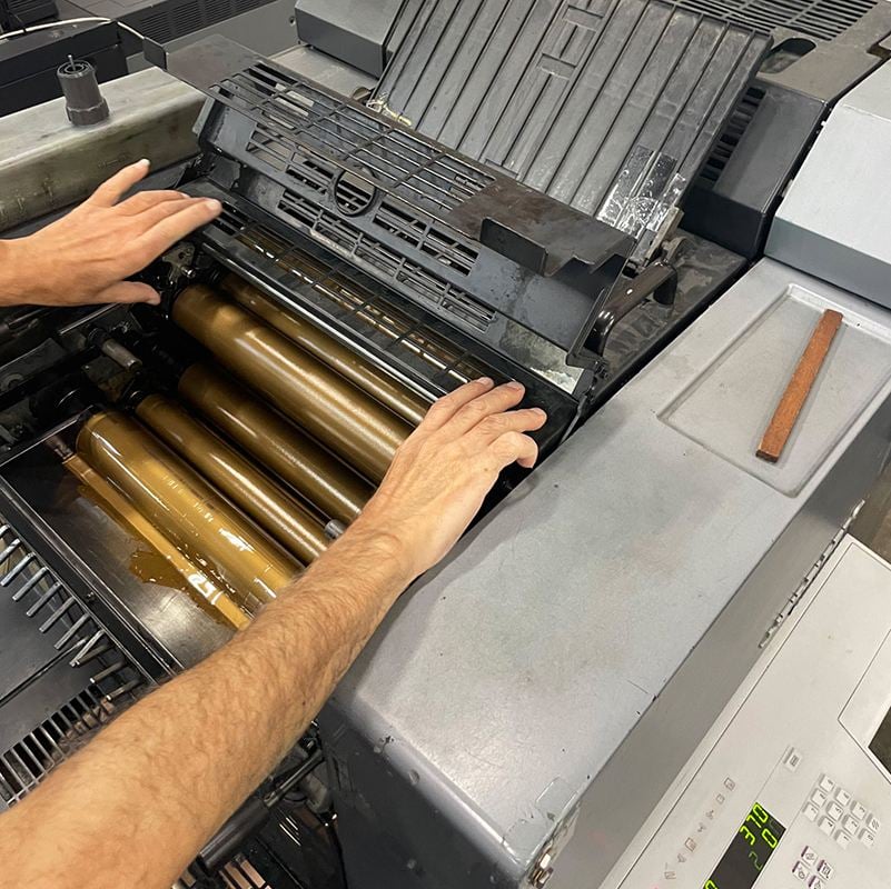
The most common choice for large print runs is offset printing. 90% of offset printing jobs include plates for four basic ink colors that CMYK stands for. These are cyan, magenta, yellow, and black. These colors are printed on top of each other in clusters to create the desired color. But if you look closely enough, you will be able to see all those mixed colors on the paper. This means that it does not create a solid color coverage, but a pattern that looks like that color to the human eye.
What are Pantone (or spot) colors
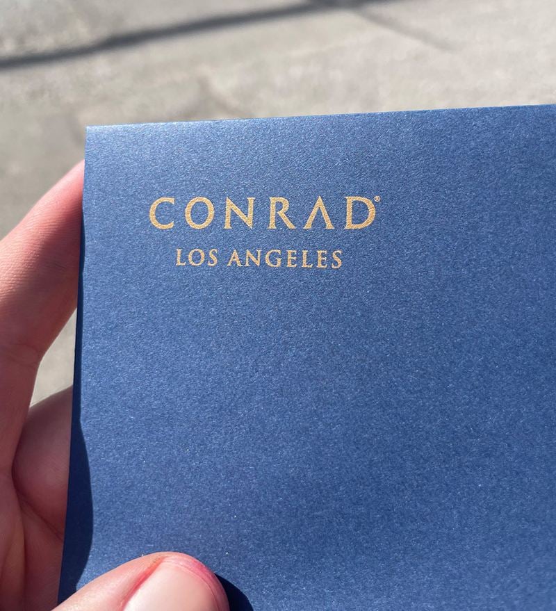
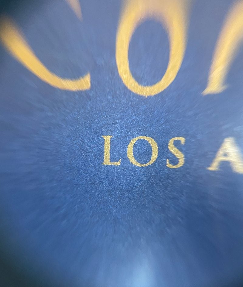
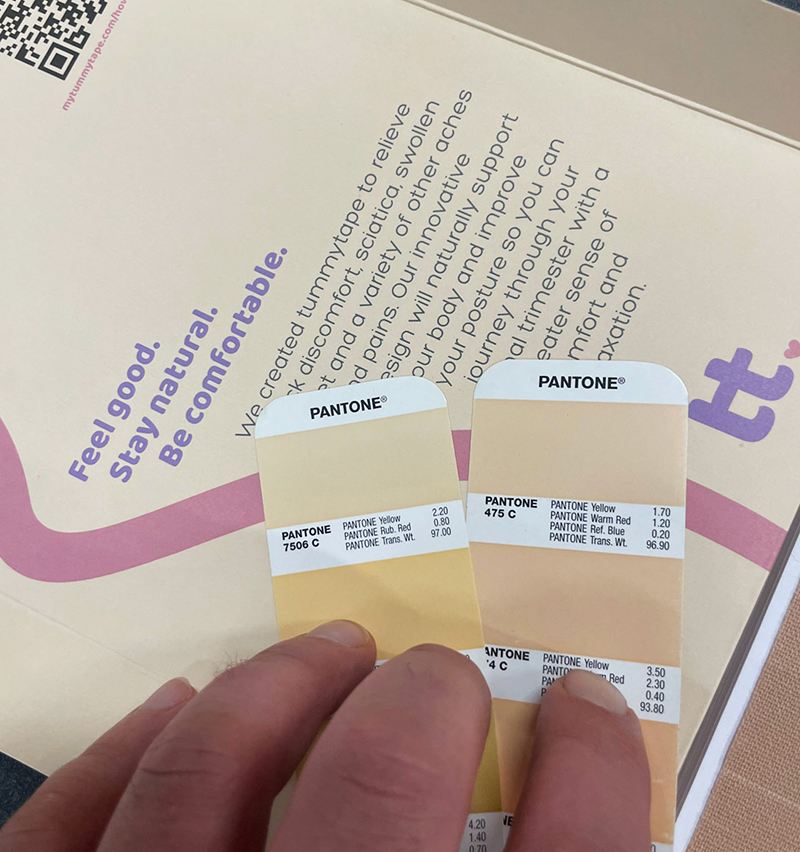
For Pantone colors, ink is premixed, and a separate printing plate is used. And this creates solid (or spot) color. No matter how close you look, this will be the only color you will see on the paper. This makes it more consistent and easier to repeat the same exact color over and over again. However, this also makes them a more expensive option than CMYK.
So, if we want to print a specific Pantone color, we would first mix the inks to get that exact color. Then, a separate printing plate is made for this color and we would add this premixed ink into the printing machine. This Pantone color would now be printed instead of CMYK colors, or on top of them.
There are different options for Pantone colors depending on the use. In print, we use PMS (Pantone Matching System).
How to know if Pantone colors have been used
As already mentioned, printing with CMYK does not create solid color, but patterns. This way, overlapping halftone grids create the illusion of continuous tones. These patterns are called rosettes. If in your printed piece you can see these Rosettes with a loupe or magnifying glass, you will know that Pantone colors were not used.
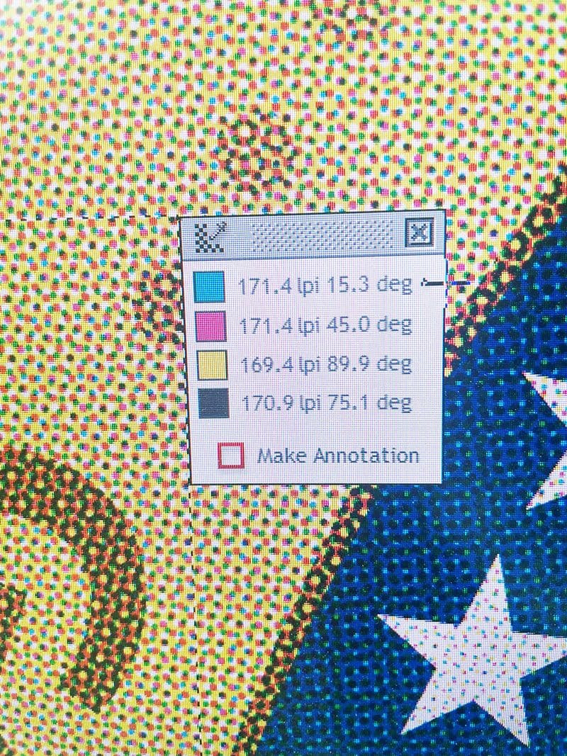
There are two kinds of Rosettes - "dot-centered" and "clear-centered".
Dot-centered rosettes usually show a less visible pattern, tend to lose shadow detail, and are popular with low screen frequencies.
Clear-centered rosettes tend to show a more visible pattern, look slightly lighter, preserve shadows, and resist color shifts better. They are more often used with high screen frequencies.
Because of the rosettes, the CMYK system is not consistent in reproducing the exact colors.
This is just the reason Pantone colors are the best option for color critical printing jobs. They have full single-color coverage without the rosettes. This ensures that the same consistent shade is achieved every time they are printed.
Although there are many positive aspects of using Pantone colors, they would be impractical for printing real life photography and multi-colored images with many shades and transition areas. Also, if you are printing an ad, it usually does not require very rich and precise shades.
How to find the right Pantone color
There are Formula Guides for Pantone colors. They are recipes for mixing Pantone colors, ensuring you get the exact shade you want. They make communication with your printer easier, as you don't have to think of a way to describe the color. All you have to do is give them the Pantone number, and they will know precisely what you want. No additional explanations are needed.
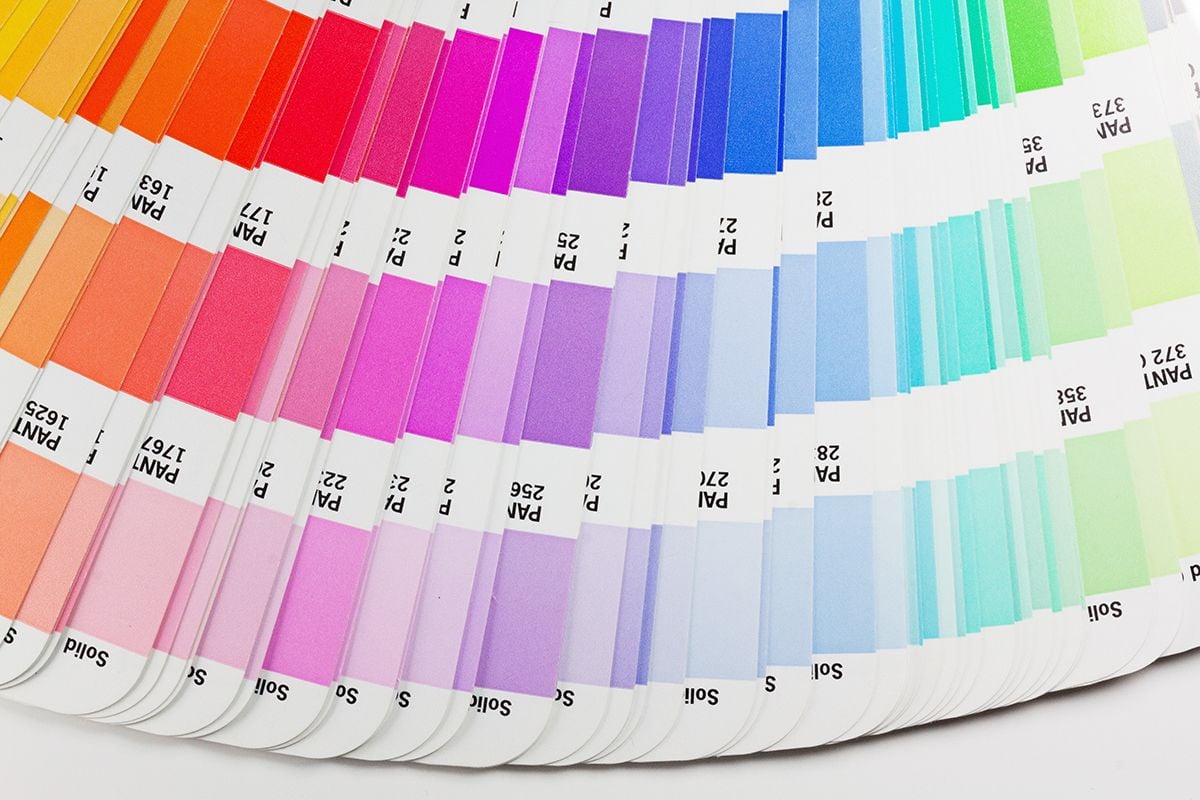
Formula Guides are made on both uncoated and coated paper stock. This is very important, as printed colors can drastically differ depending on the printing surface. Uncoated stock soaks up the ink, which gives more mute tones. Coated surfaces are glossy and make the colors look more vibrant and saturated. So, make sure you consider the stock you will use when choosing the color. Also, there is less difference for lighter colors, but as you move to darker shades, the fact that the stock is coated or uncoated plays a more significant role. So, if you are using both uncoated and coated paper stock for different projects, make sure you choose the color from the right Formula Guide for each of them to ensure the shades will match.
Imagine a high-end magazine next to a regular newspaper to better understand the difference between coated and uncoated stock.
How Pantone colors are made
There are 18 basic Pantone colors that are mixed to get all the other colors and shades. Pantone has developed a formula by which these colors are mixed. Transparent White is used to weaken the color of basic inks, which is an effect you cannot achieve with CMYK. Transparent White has all the properties of ink but without the pigment.
Pantone colors are a great option for solid, full coverage areas. They provide even density across a whole sheet.
Another advantage of Pantone colors is that with additional basic colors, you can get neon, pastel, and metallic colors which give a very prominent look.
One thing to remember is that pastels and neons are prone to fade quicker. The pastels because they have little colorant in the ink, and neons because of the UV component. Metallics are growing in popularity as they give a luxurious and high-end look, especially for packaging.
There are many suppliers that help the printing and packaging industry deliver the high-quality products to customers, like Flint Group, Hostmann, The Printing Ink Company. They provide the equipment and the chemicals we need to provide the results our customers expect.
Color Bridge Guides
Printing your brand color with Pantone inks can be costly for other additional packaging elements such as Labels to match a printed box. Only print with Pantone inks if necessary and convert other colors to CMYK.
Color Bridge Guides show how Pantone Spot colors can be matched in CMYK. This shows that spot color vs CMYK is not actually a battle, and both systems can be effectively used depending on the purpose of your print material. Both graphic and print designers can use them to visualize the Pantone color and the closest equivalent in CMYK.
This will help you to simplify the color management process across different print materials. As we already mentioned, using Pantone inks is a more expensive option. Being costly, it makes no sense to use them for low-quality orders and short-term marketing materials that will not be kept. Or for low-quantity orders that can not justify the cost.
PMS helps make color adjustments simple and budget-friendly.
When to use Pantone colors
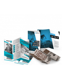
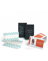
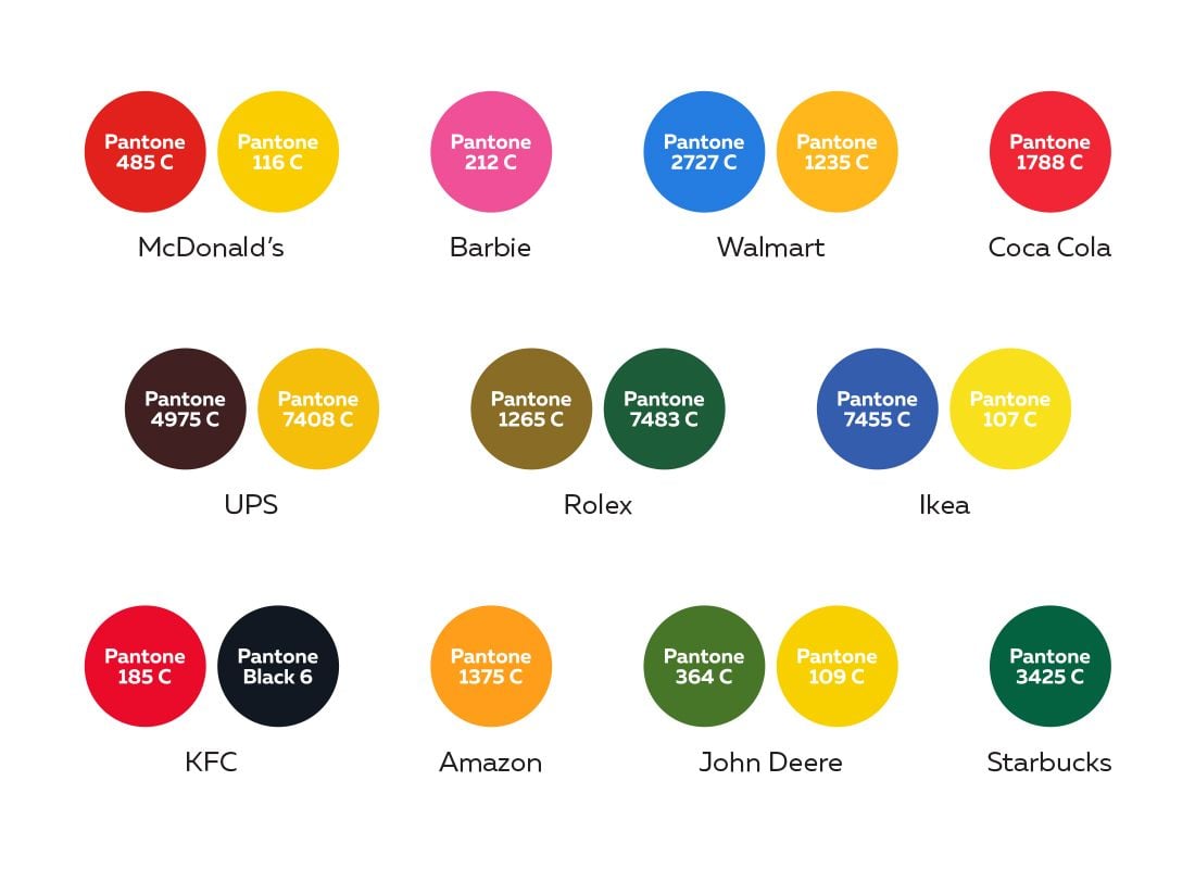
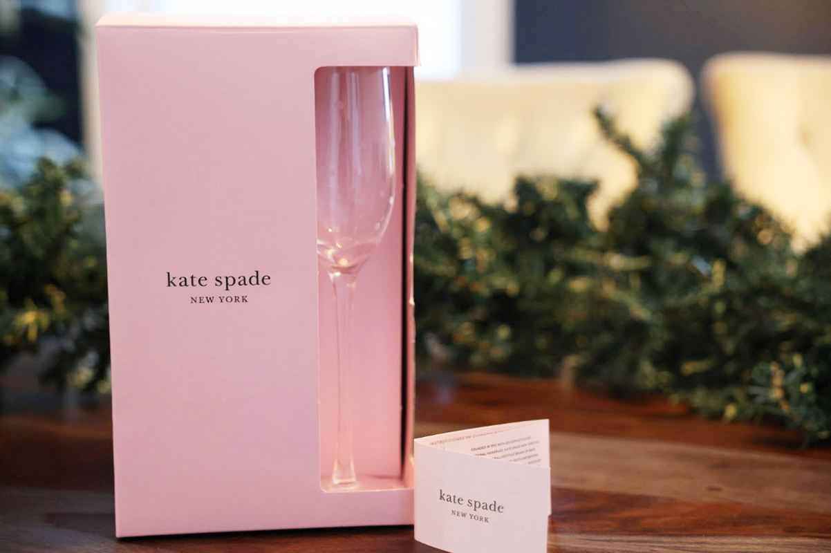
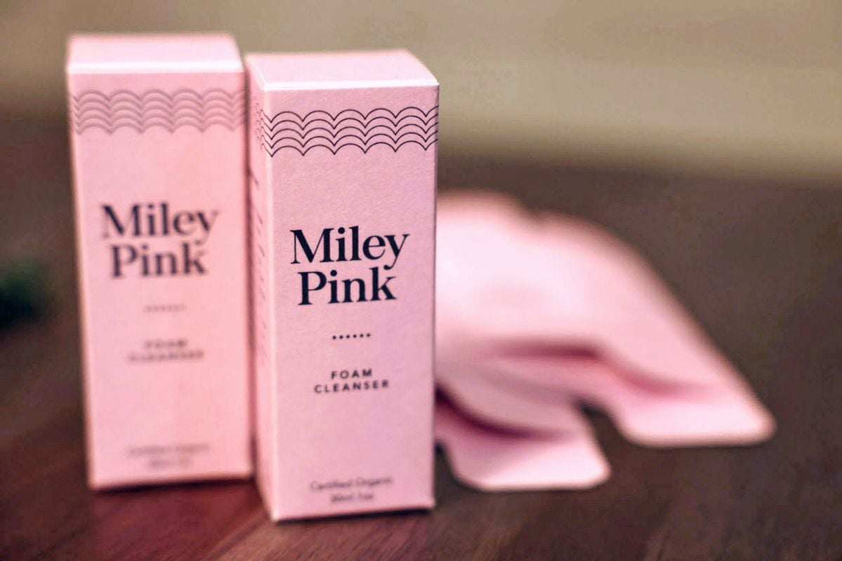
Generally speaking, Pantone colors are used when color consistency is of crucial importance while printing bigger quantities. Most commonly, Pantone colors are used for stationery, packaging and magazine covers. To keep the print job at a reasonable price, up to two Pantone colors should be used in your design. These are usually your company colors, or product colors when it comes to packaging.
Make your flagship products in Pantone to increase brand awareness and recognizability. For other print materials, use the closest CMYK color. Your business colors are representatives of your company and they promote branding.
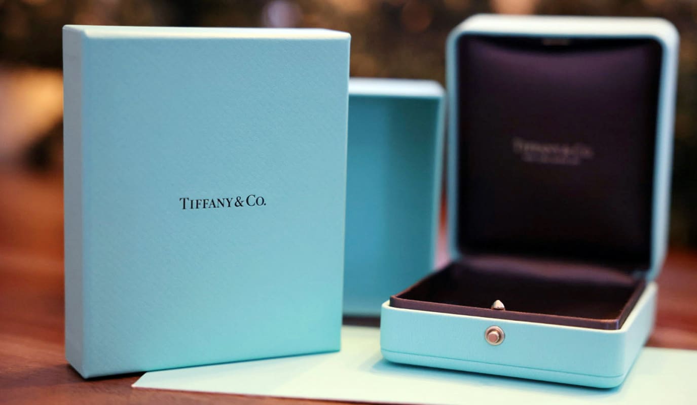
The power of Pantone colors consistency is evident when we think of brand colors such as Coca-Cola's red or Tiffany's blue, which is patented and protected. Tiffany & Co. is the only company allowed to use it as their brand color. So, it IS that important to be recognizable.
Pantone and packaging design
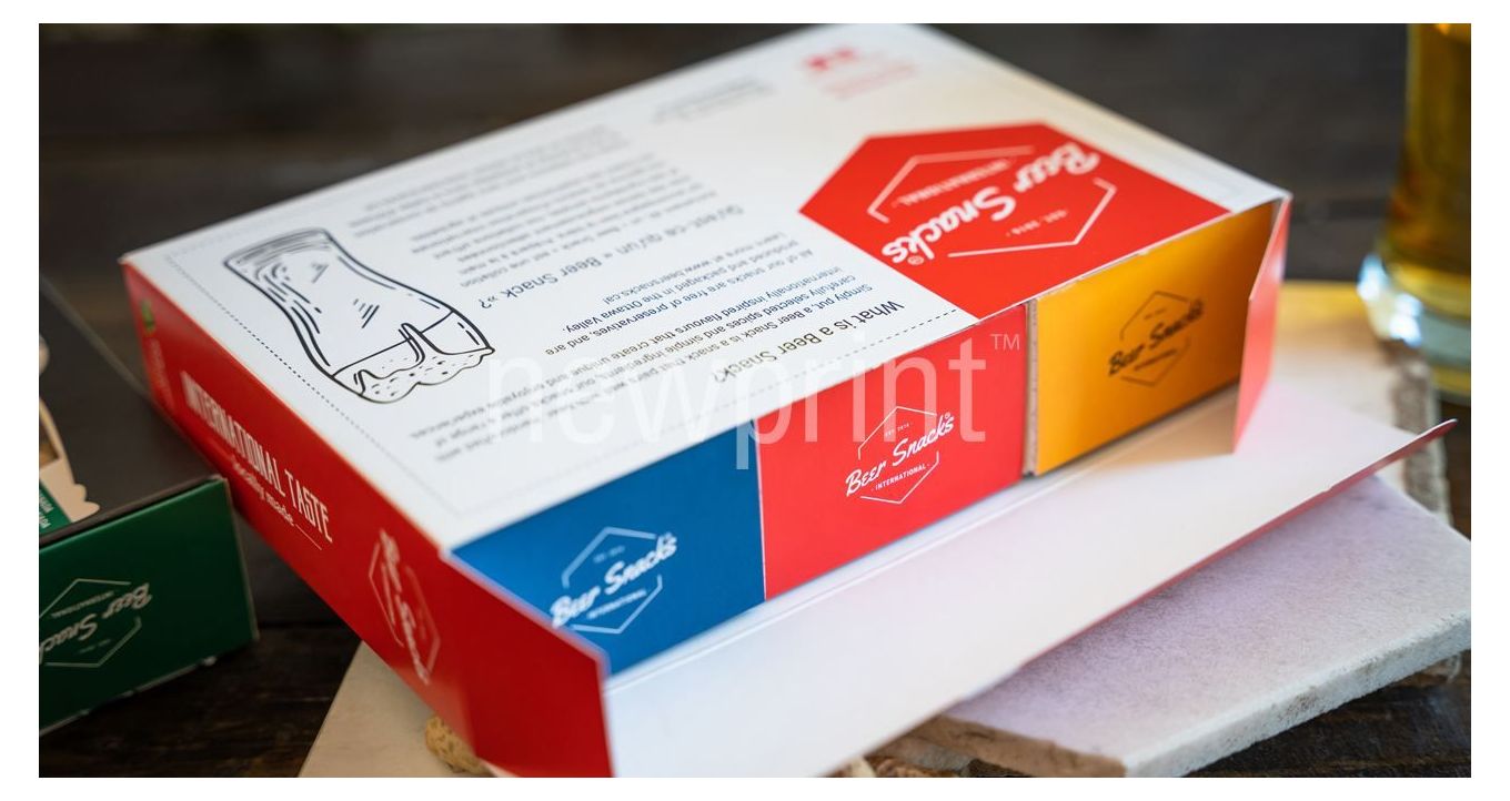
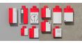
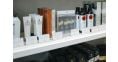
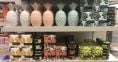
Pantone colors are most often used in packaging design and printing. They allow repeating the same print run at a future date and achieve the exact color every time. This improves product recognizability on the shelves. In the time of hyperproduction, when there are countless products similar to yours on the market, you want to make sure you are doing everything you can to be noticed. Plus, imagine having 10 or 20 of your products next to each other on a store shelf and the color of your packaging is noticeably inconsistent. This is something that could happen if you print your packaging using CMYK colors. A situation like that would not leave a very good impression on your customers. This is exactly why you would use Pantone colors for your packaging, as they are the perfect solution for this problem.
However, this doesn't mean you must make all your colors Pantone. It is common to see packaging jobs printed in CMYK + 1 or 2 Pantone colors. Simplifying your design to 1 or 2 Pantone colors will achieve the recognizability goal without skyrocketing the print cost.
Many brands with different flavors or versions of their product tend to have one common color to reflect the brand, one variant color per flavor or version to differentiate it from the others and make it easier to notice, plus black for text and barcodes. It is essential to consult your printer during the design stage, as they will give you the best advice when it comes to the use of Pantone colors and cost efficiency.
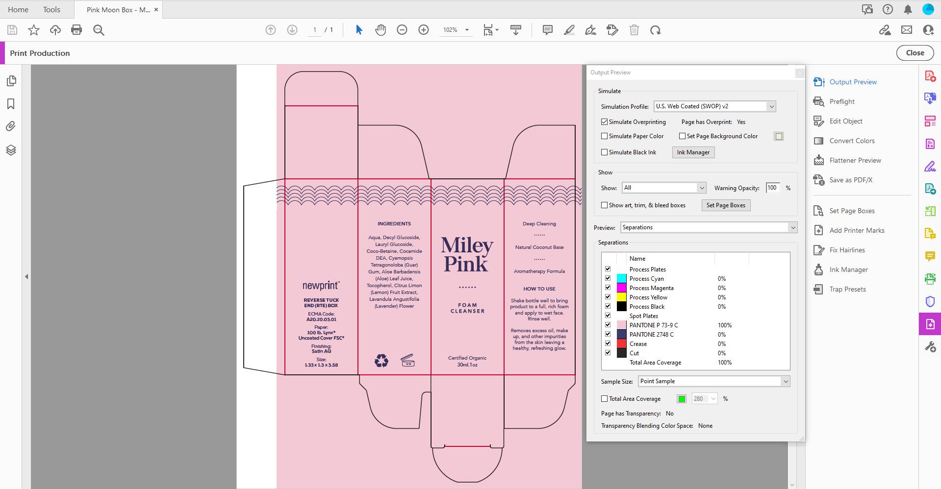
Another important thing in the design stage is to make sure your graphic designer creates the artwork with correct separations. Setting the colors correctly will ensure everything is printed as it should. Separations will show if all the colors you want are a part of the design, and also if there are any that you don't want. It is better to double-check if everything is correct than to be surprised by unexpected results. Also, in your design file, Pantone colors must be set to overprint.
Short overview
- Pantone (spot) colors have more density and are brighter than CMYK colors.
- They are precise and consistent across different printing projects.
- They are more expensive, as they are premixed and require their own printing plate.
- It is best to use them for color-critical projects.
- When printing images with many different colors and shades or illustrations with a lot of gradients it is only possible to use CMYK.
We hope you now have a better understanding that spot color vs CMYK is not a battle that has one winner. Depending on the situation, both choices are valid. Consulting with professionals that use both options daily will help you make the right decision for your product. This will make the result both aesthetically pleasing and cost-effective.