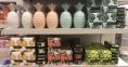
We choose the colours of the packaging based on visual preferences. But the effect of colour in packaging design on the unconscious mind often gets neglected.
We are all aware of the importance of the visual appeal of the packaging to our customers. They need to like the packaging to even notice and consider buying the product. However, businesses often tend to neglect the effect of packaging colour palette on customer’s unconscious mind. More often than not, our buying choices are made without overthinking, and the colour of packaging affects the unconscious decision-making systems directly. Although our customers will probably not be aware that the colour is important to them, it will play a part in the decision-making process. We are sharing the effect of different colour choices in packaging you should consider before deciding on the design.
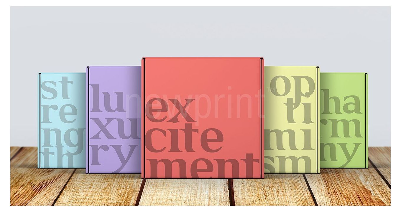
The Effect of Primary Colours in Packaging Design
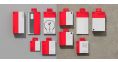
Red
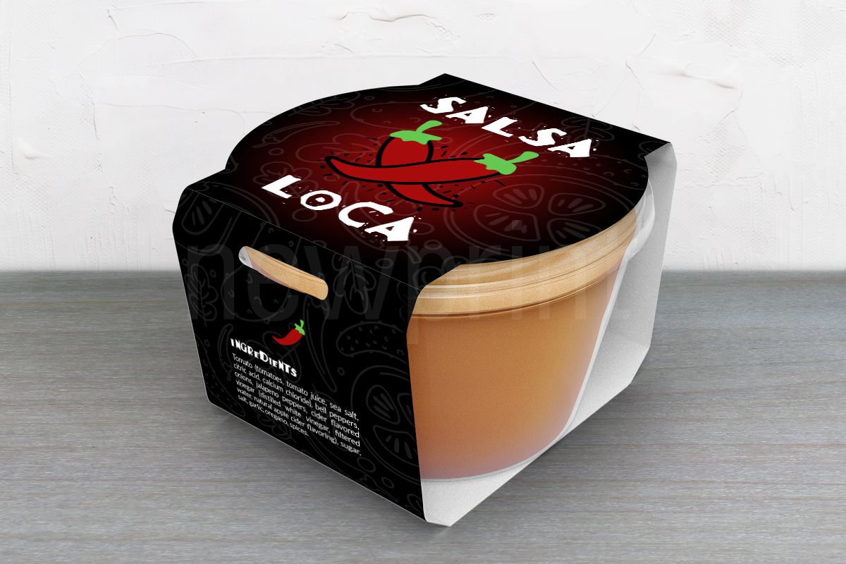
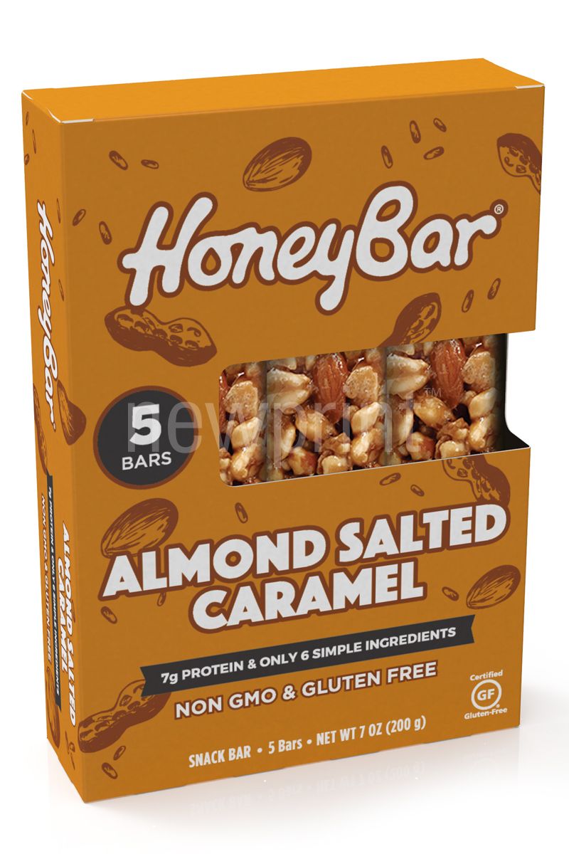
The red packaging colour is the one you will often see. Some of the most acknowledged brands (Coca Cola, Disney, MC Donalds, Marlboro) utilise the power of red in their branding. It is often used in the food industry because it represents appetite and gets the metabolism going. It is the colour of power and passion, energy and strength. Red is an exciting and warm colour that stimulates the senses and grabs attention. The word SALE is usually red. But it is also the colour of warning and danger.
Yellow
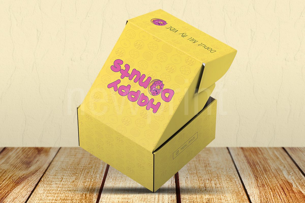
Yellow is the most visible colour in the colour spectrum, and as such will make your packaging pop if you use it as a packaging colour. It represents fun, optimism and energy. It is also often associated with innovation, originality and hope because it is mentally stimulating. It is an excellent colour choice for products that are meant to make people happy, and that’s why it is most often used for packaging targeted at adolescents and children. The effect of the colour yellow in packaging is very powerful but can be overwhelming, so it is rarely used as a sole solution. It may also represent honour and loyalty.
Blue
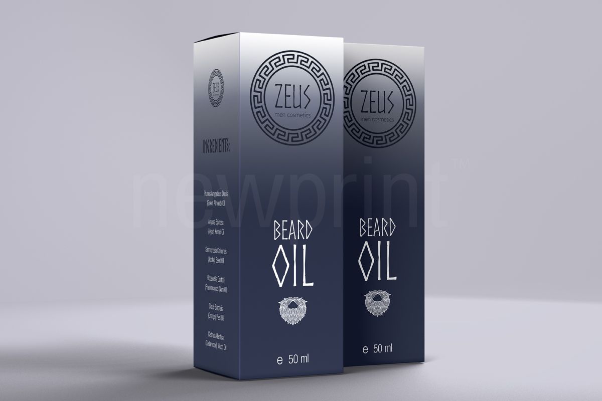
Using blue as your packaging colour makes it look trustworthy and cool. Many studies show that it is a universally liked colour, which makes it safe to use. But, you need to make sure your packaging does not look boring. Using the right shade of blue is very important. Bright blue is more appealing to younger audiences and represents creativity. Darker shades look professional and serious. The blue colour in packaging design evokes serenity and efficiency, security and reliability.
Green
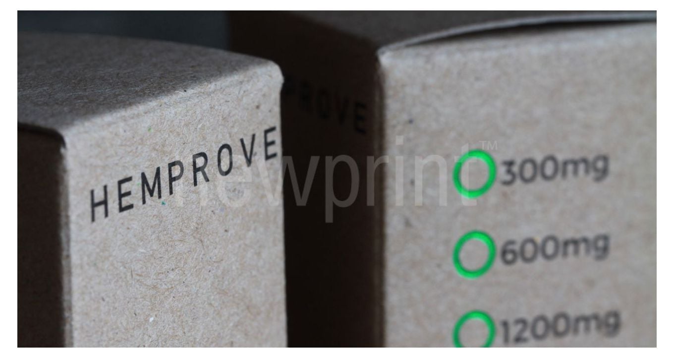
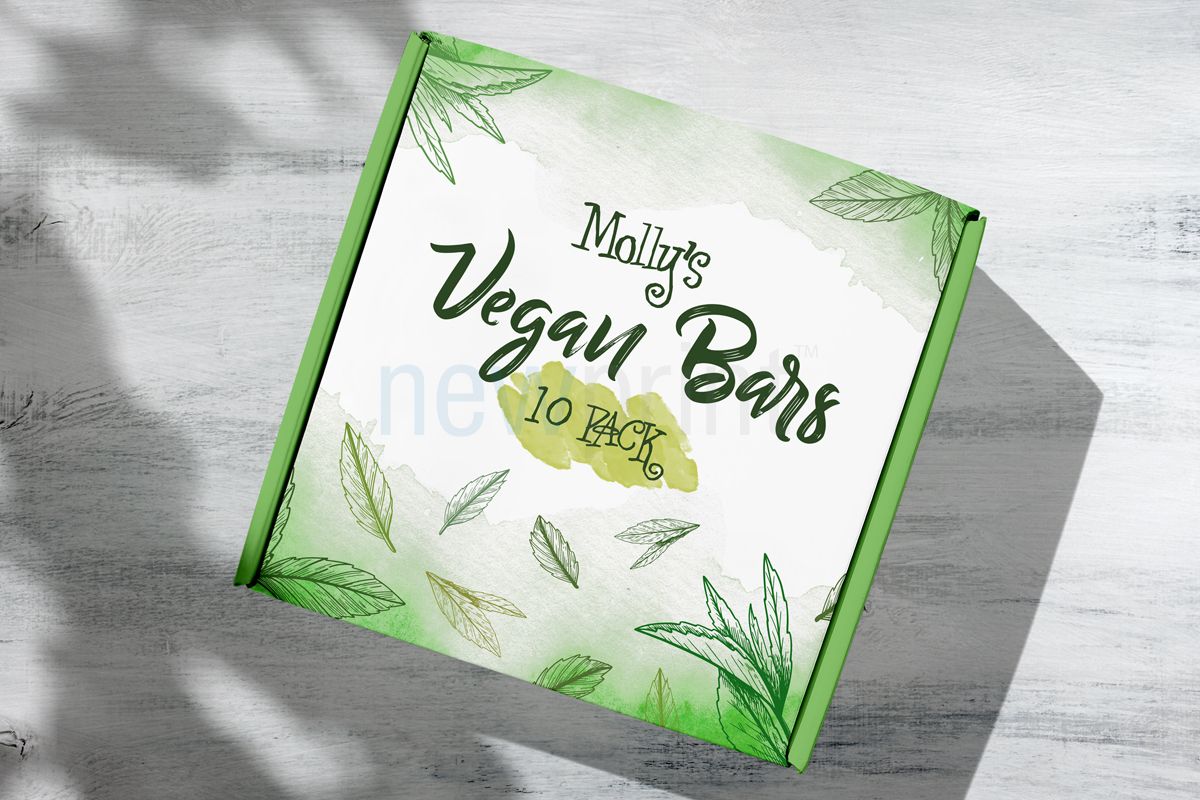
The green packaging colour is most often associated with eco-friendly and healthy natural products in its lighter shades. Darker shades are a representation of money and wealth. Green brings harmony, balance and sustainability to the mind. Light green is a good colour choice for breakfast foods. It is known to produce a sense of calm.
Purple
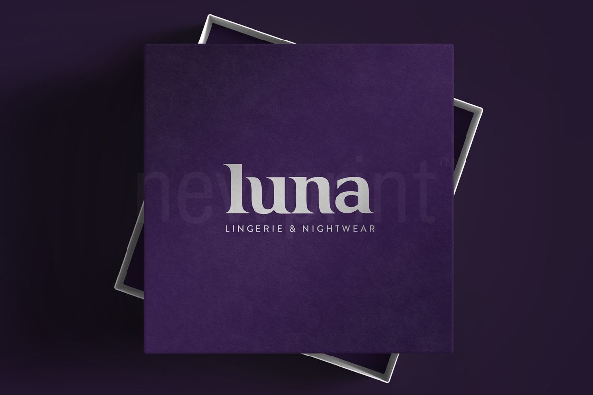
Purple relates to indulgence and luxury, extravagance, uniqueness and premium quality. It is a royal colour, so it evokes elegance and prestige. Purple packaging colour attracts females more than males, but it is becoming more universally accepted. Lighter shades are perceived as nostalgic and fantasy related.
Orange
This colour is for products that are friendly, fun and adventurous. It represents energy, and it is related to satisfying foods. Orange packaging is associated with cost-effectiveness. Orange is also a representation of youthfulness, tropical weather and creativity.
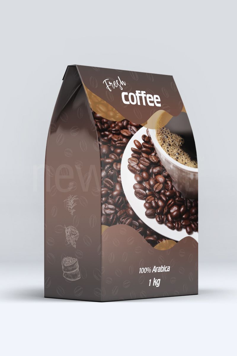
Brown
Brown is an earthy and relaxing colour, but it can also represent strength and reliability. It is associated with homely and comfortable, as well as organic and wholesome products.
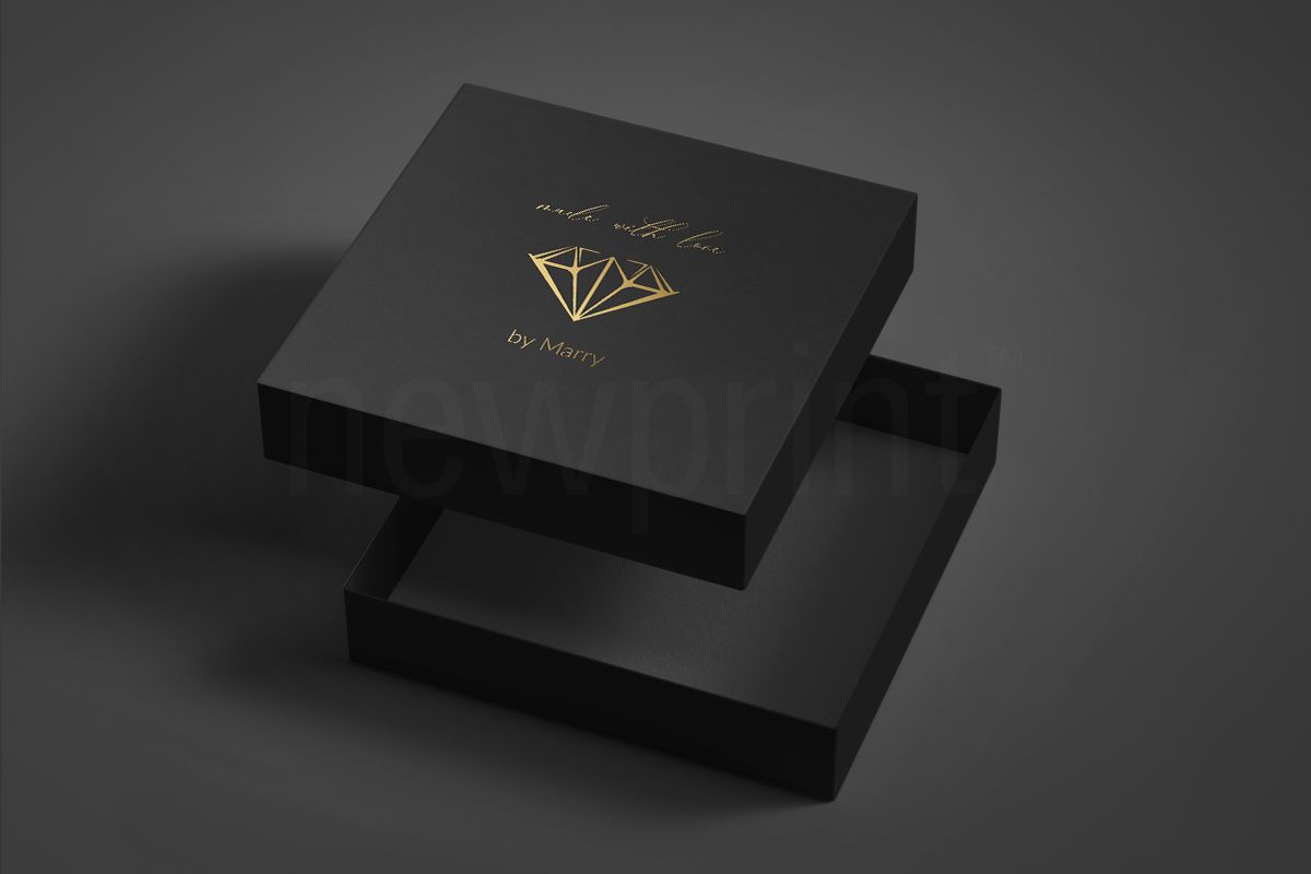
Black
Black is the colour of strength and authority. It is used as packaging colour for high-end products. Especially combined with gold or silver details, it creates an expensive look. Black in packaging means sophistication and luxury. The negative effect of the colour black in the packaging may be that it is a colour of grief, and it can represent the fear of the unknown.
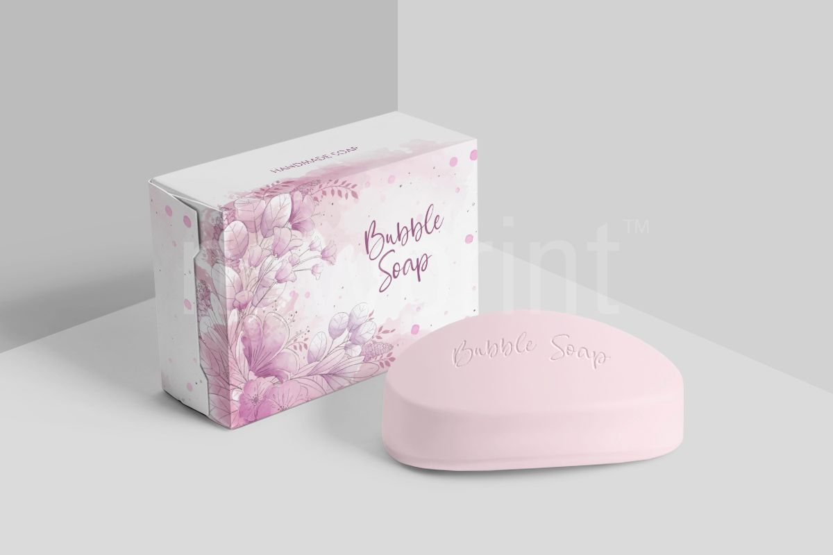
Pink
Especially in its softer shades is used for products related to femininity. It is a representative of beauty and calm, which makes it the perfect choice for cosmetics. Darker shades are perceived as elegant and sophisticated.
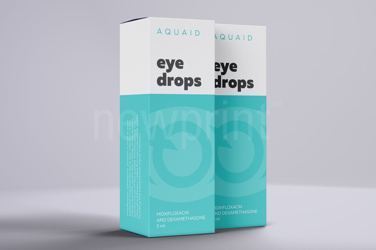
Turquoise
Turquoise is a good choice for health-related or cleaning products. It symbolizes purity and calmness without being too sterile.
Choosing the best packaging colour is an important part of your branding. Knowing what colours attract customers to buy will help you make the best possible decision. You can learn more about choosing packaging, creating print-ready files or Tips and Tricks for packaging design in our other blog posts. Or simply contact us to discuss your project with our design team.