Tips for formatting text in print files.
In this blog post, our graphic designer Zoran, who is very experienced in preparing files for print, wanted to give you some insider tips about typography in print design.
Let the page breathe
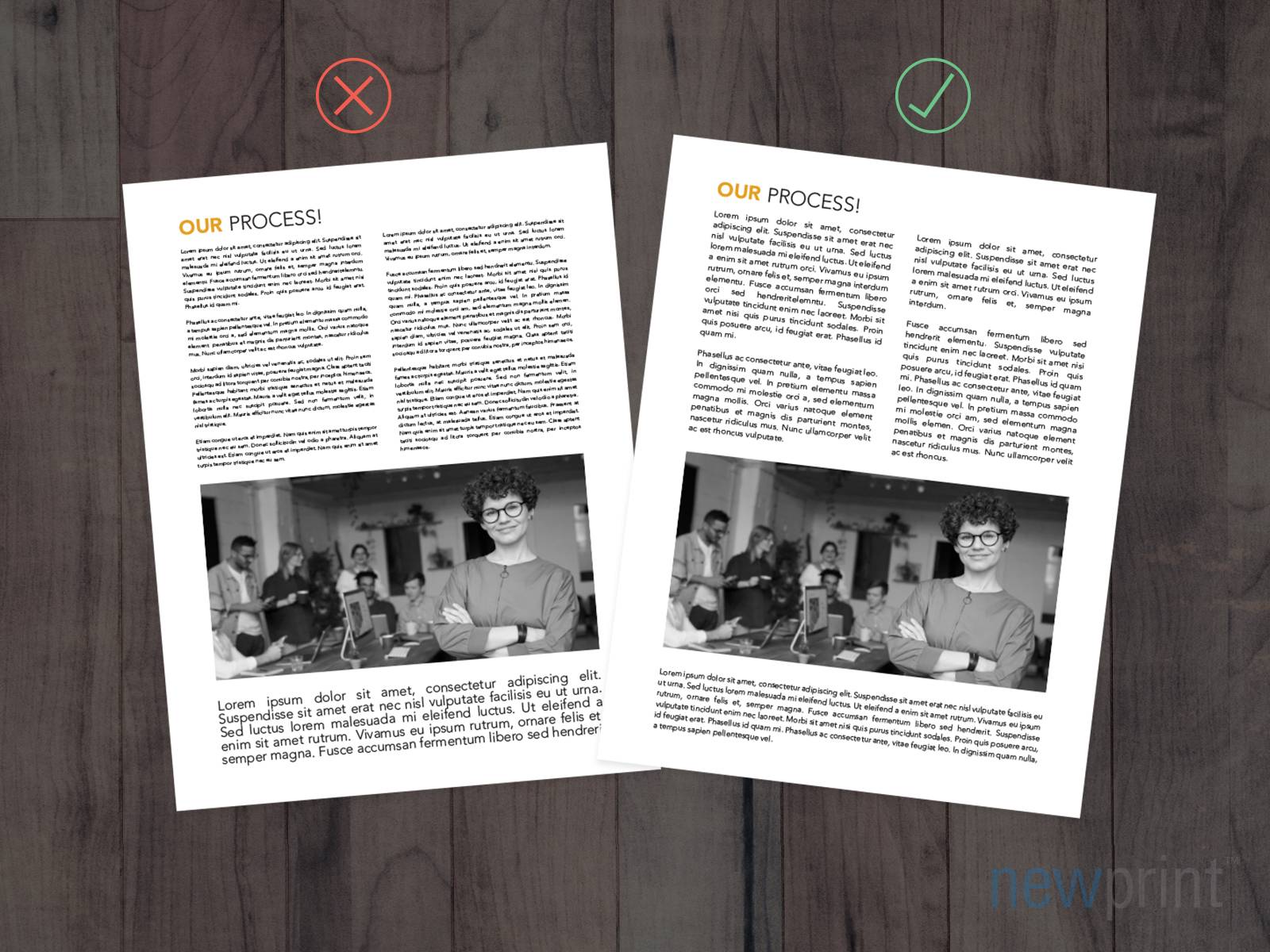
You should leave enough empty space towards the edges. On the technical side, the text should be at least 0.125” - 0.25” away from the edges. But aesthetically, your design will look much better if there is even more empty space than that.
Don’t use too many fonts
When it comes to the number of fonts in your design, you should follow the Italian pizza masters’ rule - do not mix too many ingredients. For the best result, keep it simple. You shouldn’t use more than two complementary fonts. Having too many fonts will make the design look crowded and will be hard to focus on.
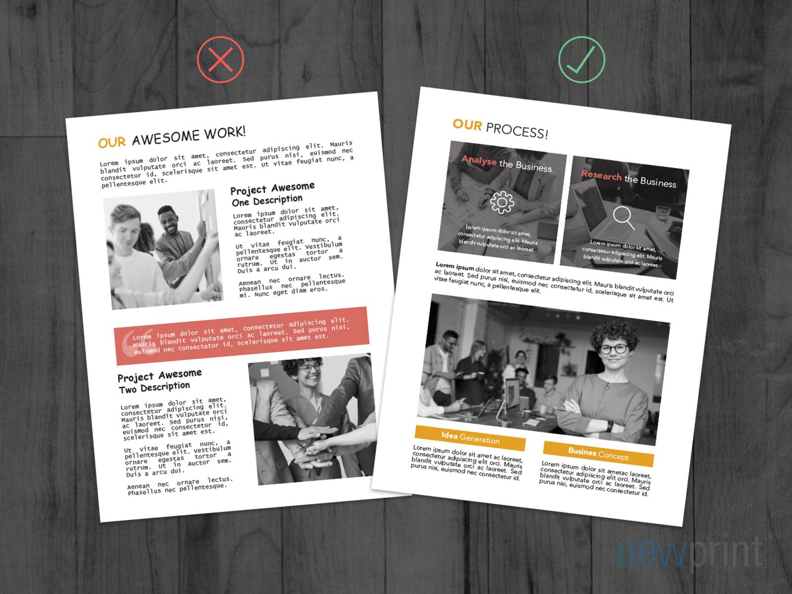
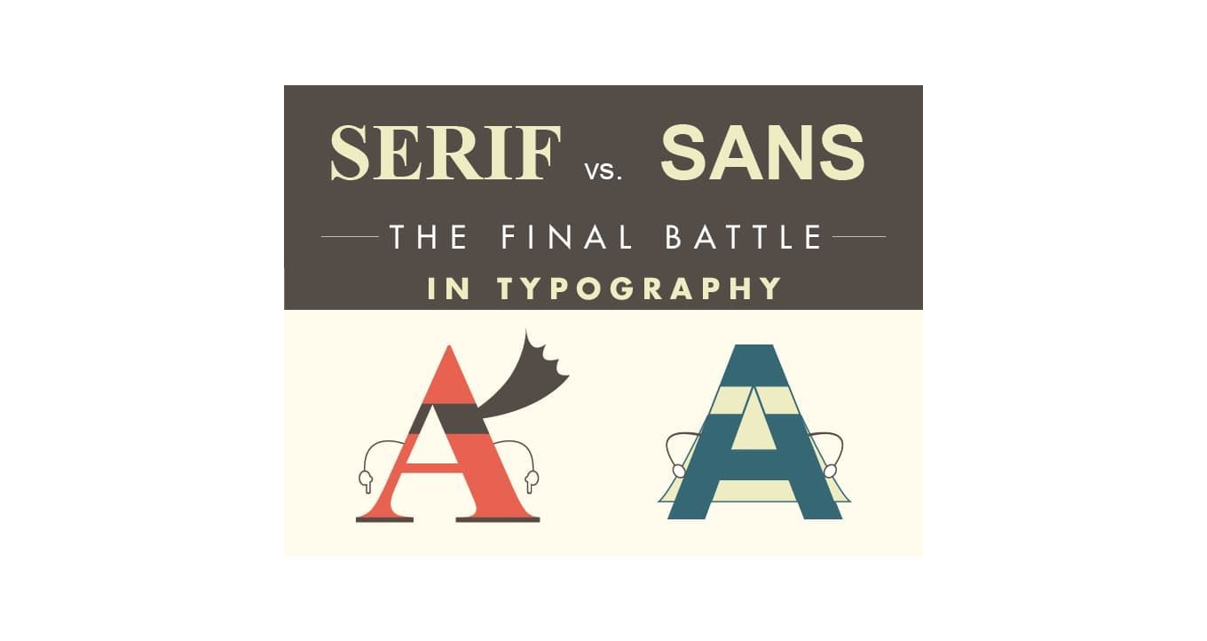
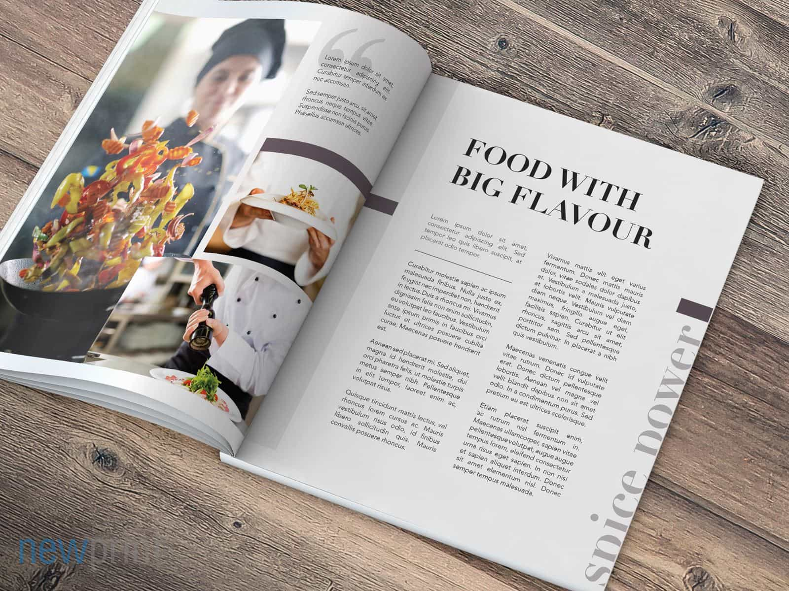
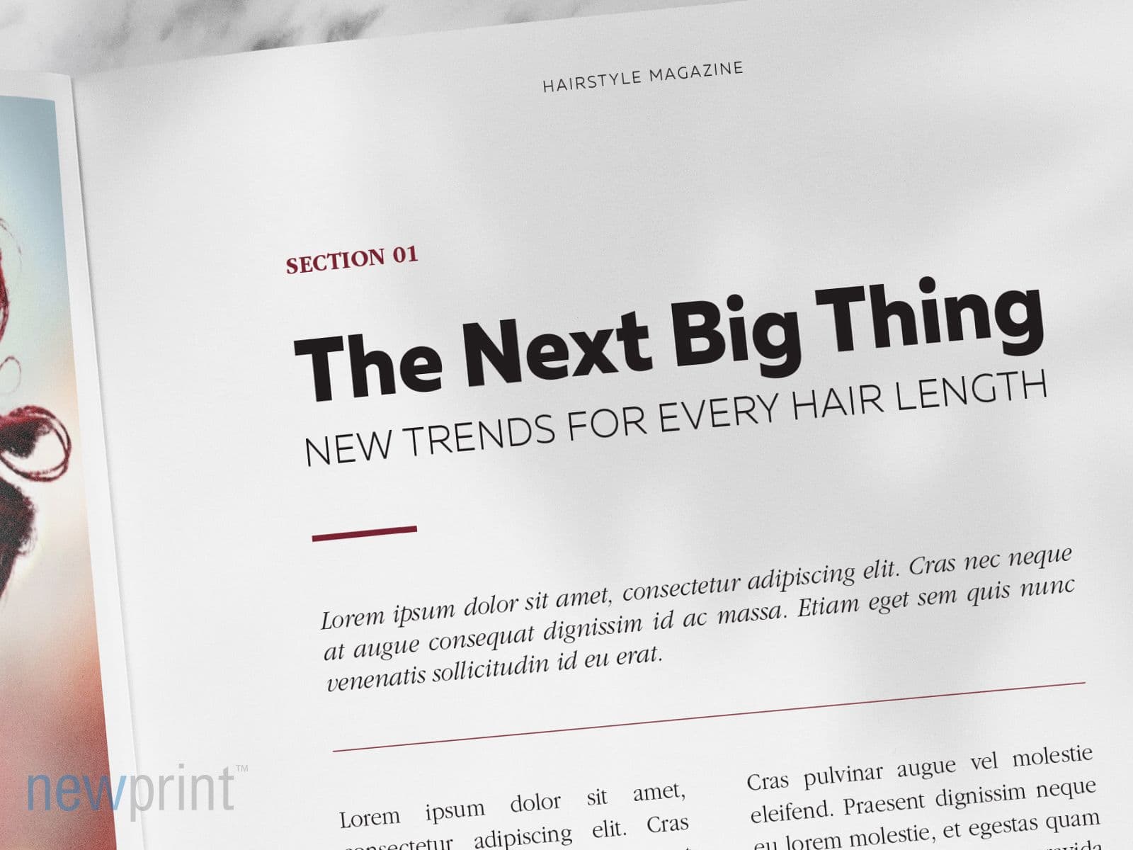
Combination of serif and sans-serif fonts
It is the best choice in most cases. You should use one font style for the headlines and the other for the body of your copy.
Make it easy to read
Font styles you decide to use should be easy to read. You do not want your message to get unnoticed because the customer could not read it. In case you choose to give fancy-looking cursive fonts a try, you shouldn’t overuse them. Short headlines, or highlighting certain words should make the desired impact without making the reader’s eyes strain too much.
Avoid font sizes smaller than 6 pt
When designing for small-size products, such as hangtags or business cards, it is easy to overlook the fact that the text is tiny and can be hard to read. If that is the case, it is better to find a way to convey your message with fewer words, and a slightly bigger font size, than to make it unreadable, just because the design looks good aesthetically.
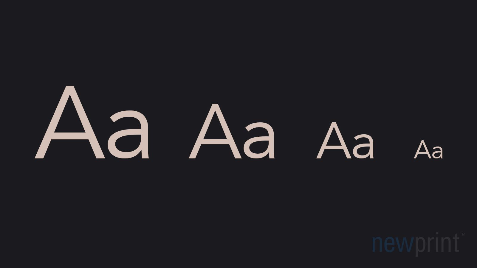
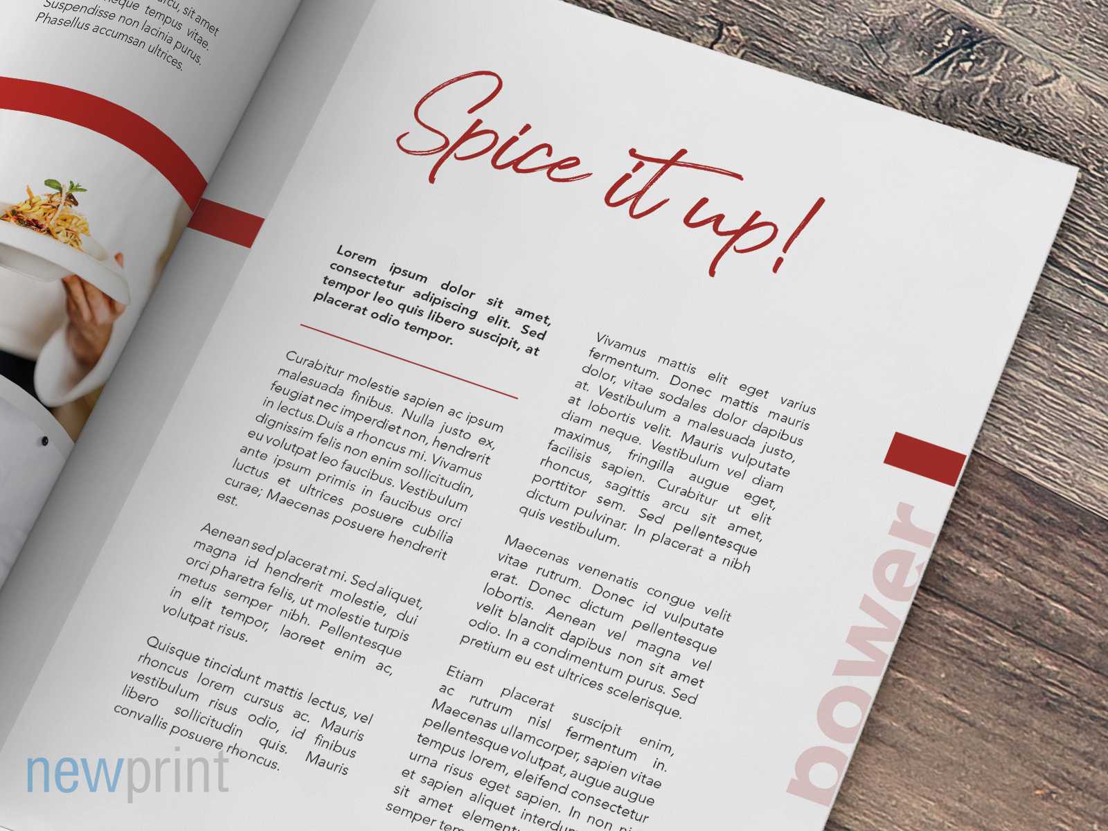
Make your text more dynamic
Using different font weights creates contrast and makes your text more interesting without too much effort. For even better effect, use fonts that have a lot of weight options and skip one or two font weights (for example, put light and bold instead of regular and bold).
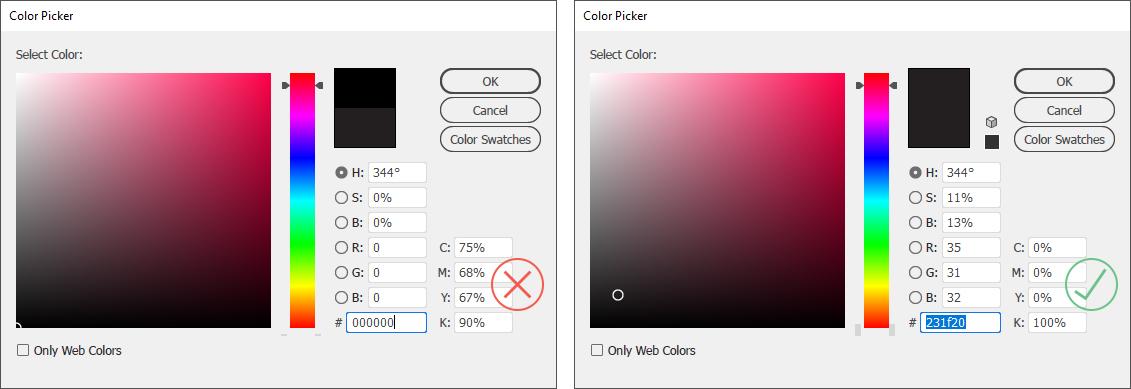
Always use 100%K for black text
Without getting into too many details, this helps the text print sharper. Your software may be configured to set the black colour using all 4 print colours ( CMYK ). Furthermore, this problem also appears in case you use RGB colour mode in your print design instead of CMYK. This can create problems in print, which are especially visible at smaller font sizes. If you use 100%K, it leaves less place for errors.
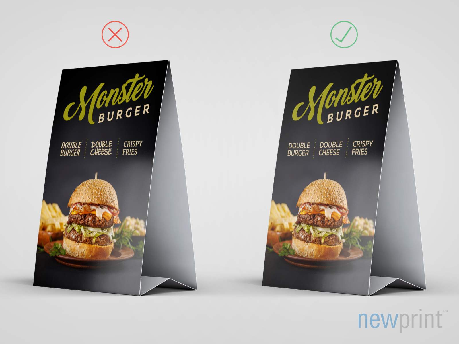
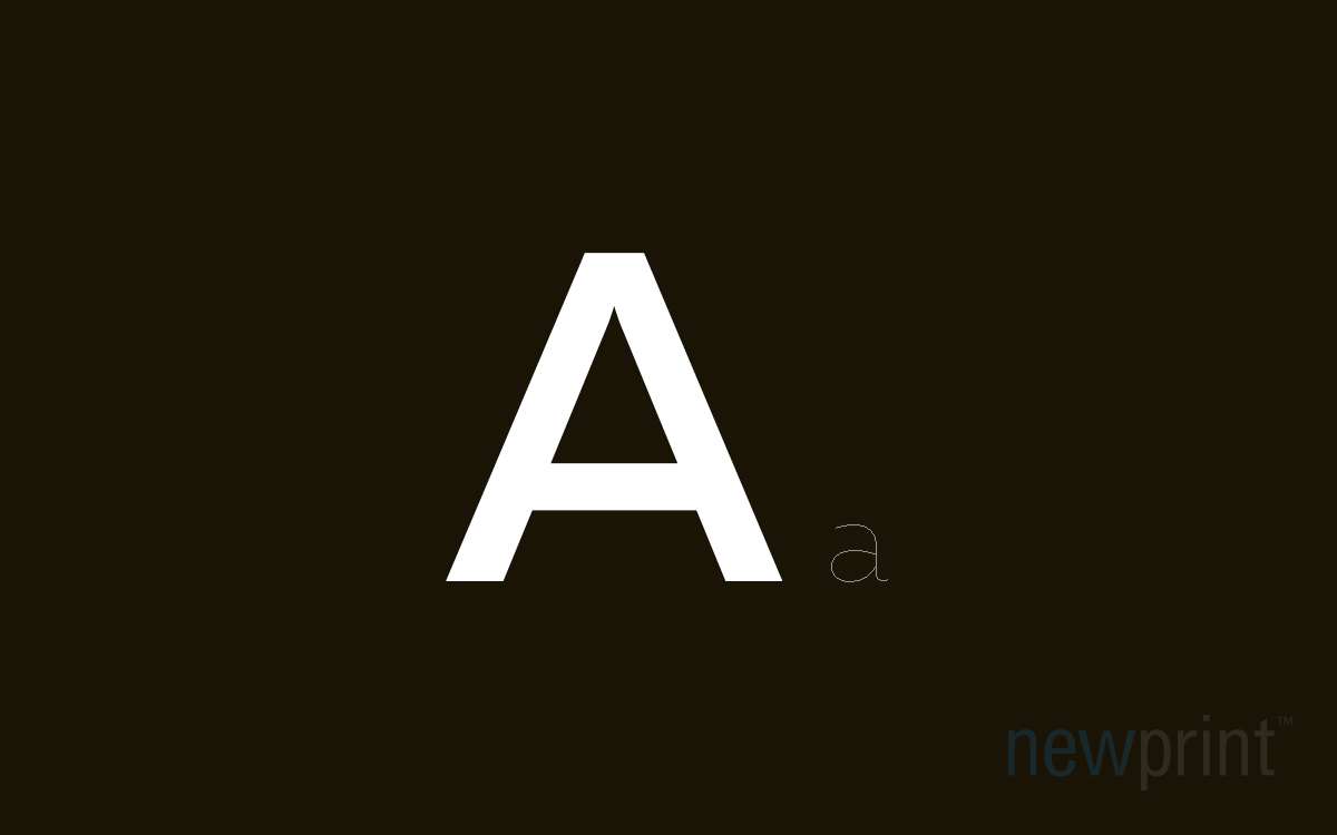
Be aware of reverse type limitations
When placing white font on a coloured background, you should avoid thin and light fonts. This especially applies to smaller font sizes. The paper absorbs the printing ink, and heavier ink coverage will spread on the paper surface more, causing the ink to push inside the white surface. Even though this mostly happens at a microscopic level, it can still choke thin and small white text. We are continually returning to possible readability problems because these are widespread mistakes that can easily be avoided.
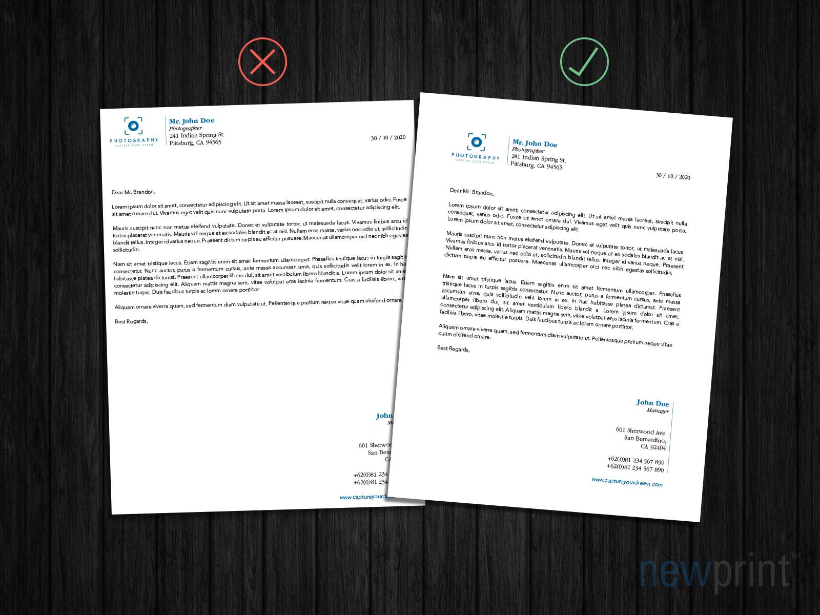
Pay attention to text size
You should always make sure that your text is the appropriate size, compared to your artwork’s overall size, both technically and visually. None of these two sides of the design should be neglected. For example, a 7pt font size is ok for business cards - it is a small piece of paper with just a few lines of text info, and this font size is appropriate for a document of such small dimensions. But it is not a good idea to use it on a large amount of text, such as on letterheads or in magazines. Even though the 7pt text is printable, it still needs to be readable and aesthetically appealing.
Match the fonts with the content
The tone and content of your text should influence the choice of fonts you use in the design. If you are formatting an academic text or designing a serious Business-2-Business brochure, the fonts should be more classic and basic. But if the content is more playful or creative, there is a lot more freedom in your font choice.