Sections in this article
The most basic definition of printing is putting ink on paper. How that ink is used to create the image is a far more complex process, and can be impacted by several factors. The most important of these factors is Colour. This can refer to the actual hue of an element in the design, but in the technical sense, it refers to the different systems for classifying and mixing colours. Printing primarily uses the CMYK and Pantone systems, with black ink playing a very important role in ensuring a proper print output
CMYK Colour Space
CMYK stands for Cyan (C), Magenta (M), Yellow (Y), and Black (K), and is also referred to as “4 Colour Printing” and “Process Printing”. Most “Full Colour” printing uses this system, where all the different colours in the artwork, from pictures, vector artwork, text, to solid shapes, and special effects, are all created using just these four inks.
This is important when designing because if the artwork is designed in a different colour space (like Red Green Blue), the artwork will need to be converted prior to printing. This can cause the colours to change, sometimes dramatically, from what is seen on screen and the final piece. RGB has a much larger colour “gamut” or range than CMYK and is normally used for web design. Therefore, many colours will look very bright and vibrant when in the RGB space, and more muted and less brilliant when converted to CMYK. To prevent disappointment and to ensure the colours that are printed are as close to the intended hue as possible, the colour space of the design document should be CMYK. If primarily designing for print, CMYK can even be set as the default colour space for a design program.

Pantones
When a very specific colour is needed, like a corporate or brand colour, or artwork requires special ink, such as metallic or neon inks, Pantone inks are used. These inks are mixed according to the Pantone Matching System, and so are sometimes referred to as PMS inks. The inks are chosen from “Colour Books”, literally hundreds of inks grouped into swatch books, with the “ink mix” (or recipe) included so that no matter where the item is produced, the printers will always have the same recipe. The standard Pantone colours are designated with a number and are mixed using different proportions of specific mixing inks, which can be looked up in the swatch book. Specialty Pantone inks, like metallics, neons, and pastels, are purchased pre-mixed from ink companies, and therefore increase the cost of a project that utilizes them.
This is important when designing a file for printing, as they can cause issues during pre-press file processing. If Pantone inks are present, but the item will be produced with the standard Process colours, the file will need to be converted. Depending on how this is done, the results can vary. This can cause the final colour to be slightly or wildly different from the original Pantone colour, depending on the profile used for the conversion and the Pantone being converted. To avoid this issue entirely, Pantone inks should only be used if the product will actually be printed with Pantones.
Even if Pantones will be used for printing, this does not mean that a large number of Pantones should be added. Most Pantone jobs are one or two colours only, sometimes one Pantone plus black, sometimes just one or two Pantones. Rarely, a project can be three or four Pantones, or even CMYK plus Pantones. Regardless of the number of Pantones being used, only the ink numbers that will be used in the final print should be included in the design. If there are more inks than expected, this can cause confusion, extra processing time, and/or additional costs if a prepress technician has to go through the files and convert or remove the excess inks.
Pantone Colours in Design Software


Greys
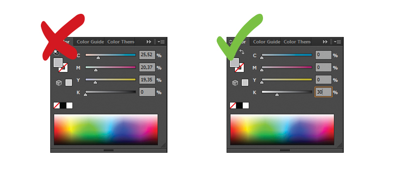
Grey in print-bound artwork is an interesting topic and causes far more problems on press than one might think. If the grey is comprised of either CMY inks or CMY with a small amount of black ink, the actual hue of the grey can vary wildly depending on the colour balance and ink settings on the press sheet. When the Cyan is the dominant ink, the greys will look more blue, or cool. If the Magenta and/or Yellow are more prominent, the greys tend to look warmer and may end up more on the brown side. Getting a proper grey balance can add significantly to the time required to print a job if the pressman has to constantly monitor and adjust the inks to make sure the colour cast on the sheet doesn’t drift warmer or cooler.
It is therefore considered best practices for grey to be comprised of only black ink. This removes all the potential for an unwanted colour cast and greatly reduces the “makeready” time or the amount of time it takes for the pressman to get a good press sheet. Black ink is neutral and does not have an inherent hue, so it is neither warm nor cool. It also produces cleaner solid areas of ink coverage, as there is only one ink in that particular area rather than three or four.
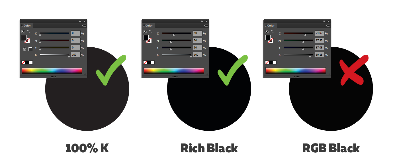
Rich Black
The recommended colour mix in CMYK for supported (rich black) contains 100% Black, 40% Cyan, 30% Magenta, and 30% Yellow. This is useful for large areas of solid black to ensure the printing does not output looking dull.
 CA
CA US
US